
A field note on mineral colour, material memory and finding palettes outside the screen. From wet basalt to oxidised metal, it traces how real surfaces can create more believable digital colour relationships.
Look longer than the first colour
Wet basalt is not simply black. It can contain a blue reflection, a green stain and a pale edge where the light catches. A useful palette begins with those relationships rather than a single colour sampled from a photograph.
We photographed surfaces in open shade and direct light, close enough to see texture and far enough away to understand their setting. The differences were a reminder that colour is always experienced beside something else.
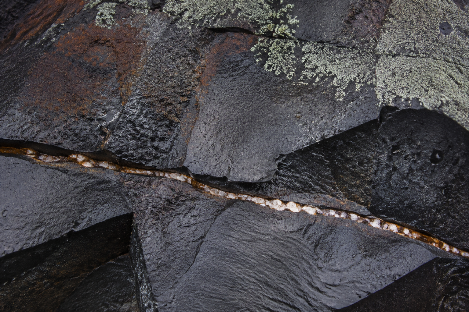
Black is only the first reading. Reflections, mineral seams and lichen create the palette.
Translate, do not copy
A colour that feels luminous in a landscape can become harsh on a screen. A subtle mineral tone may disappear when used for small text. Moving a palette into an interface requires different decisions from reproducing a photograph.
We separate atmospheric colours from functional ones. A deep petrol can provide a strong surface; a lighter mineral tone can be used as an accent. Text and controls still need to be tested against their actual backgrounds, including hover and focus states.
Build a family of relationships
The most useful reference is often a group of colours with different roles: a dark anchor, a neutral field and a restrained point of contrast. Their proportions matter as much as the individual values.
Try the palette on ordinary content before judging it on a dramatic hero image. A paragraph, a form label and a navigation link will reveal problems that a large photograph can hide.
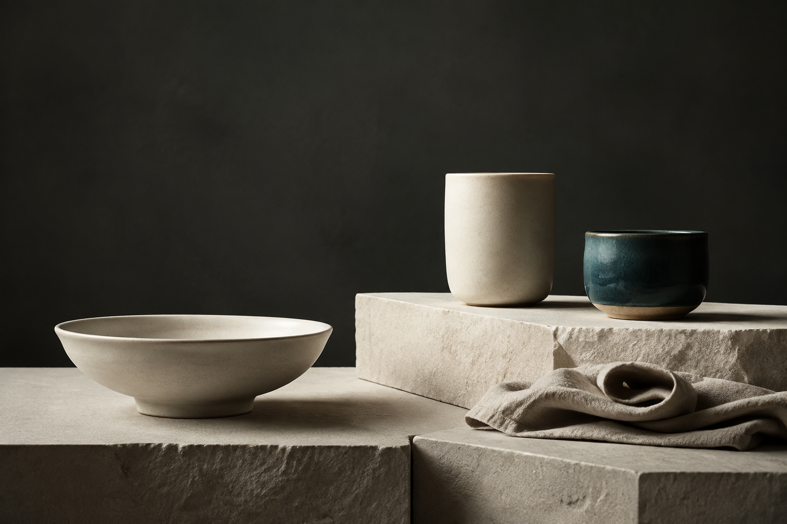
A material reference becomes useful when its colours take on different roles.
Keep the source nearby
The original observation remains useful even after the palette has changed. It offers a reason for a colour decision and a way to check new additions. A later accent can be compared with the same family instead of chosen in isolation.
Looking closely at a surface is not a shortcut to an instant identity. It is a way of finding specific relationships that can make digital work feel less arbitrary.
Share this article ↗ ← All journal entries
