
A long-form essay on building visual systems that remain convincing when the source material refuses to behave. It looks at hierarchy, image sequencing and the value of rules that guide without becoming rigid. Includes field observations and a practical checklist for adapting a page under pressure.
The forecast changed three times before breakfast. Our carefully planned sequence of photographs did not survive the first hour. The project became better when we stopped treating that as a problem.
Let the conditions lead
A plan gives a team direction, but it should not become a promise the material has to keep. On location, cloud, wind and visibility determined which parts of our original idea were still honest. The wide, sunlit opening we had imagined became a much quieter picture: dark rock, a pale horizon and almost no sense of distance.
At first we tried to make the new photographs serve the old sequence. We brightened shadows, tightened crops and searched for a substitute for the image we had not made. None of it felt convincing. The turning point was to put the plan away and look at what was actually in front of us.
We separated the non-negotiable decisions from the flexible ones. Reading width, navigation and the relationship between title and body copy stayed fixed. Crop, image order and the pace between photographs could respond to the day. That distinction kept the project coherent without making the edit feel predetermined.
This is useful far beyond a photography assignment. A studio may have an excellent process image but no polished portrait. A small hotel may have a memorable view but only a handful of rooms to photograph. Start with the strongest, most truthful material. Let it set the rhythm, then build the supporting structure around it.
The question is not whether every page follows the original drawing. It is whether every decision still serves the same story.
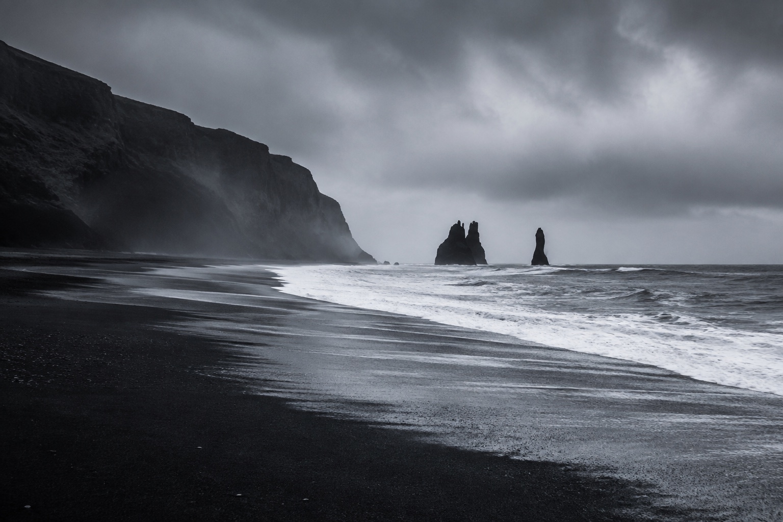
A pale horizon and dark shore give the sequence its quieter starting point.
Consistency is not sameness
Consistency is often mistaken for repetition. In practice, it is closer to recognition: a reader should understand the visual language even when the composition changes. A familiar voice does not have to say the same sentence twice.
We laid the photographs out in a long sequence before thinking about individual screens. Several strong images became weaker when placed next to one another. They shared the same horizon, the same distance and the same grey light. Removing one gave the other room to work. A close detail of stone then made the following landscape feel expansive again.
The edit taught us more than another layout variation could. We kept a few relationships stable: condensed display type against calm body copy, mineral colours against warm paper, and a clear distinction between an image that carries the story and one that explains it. Within those relationships, the composition was free to change.
A caption belongs near the image it describes. An important paragraph deserves a comfortable reading width, not a larger box. Related information should be easy to find without competing for attention. These are small decisions, but readers experience their cumulative effect as confidence.
Before adding a new visual treatment, ask what the content needs that the existing one cannot provide. Sometimes the right answer is a new arrangement. Often it is simply a better edit.
“A useful system repeats the relationship, not the layout.”

A close material study changes the scale after the wider coastal view.
Leave room for the unexpected
Unexpected material exposes whether a design is genuinely useful. A fragile layout needs perfect images and ideal copy lengths. A resilient one can absorb a portrait photograph, a long caption or a late change without losing its character.
Back at the studio, we tested the sequence with photographs that had almost been left out. One frame was too dark for the opening. Another had no obvious focal point. Used between two more descriptive images, both became useful pauses. Their value depended on where they appeared, not on how impressive they looked alone.
We applied the same test to the words. A headline that needs an exact line break to work is not yet finished. An excerpt should still feel considered when it is two lines shorter. On a phone, images and captions must remain together, while the text needs enough space at the edge to be read without effort.
Our final review was deliberately ordinary. We opened the article on a small screen, followed every link, read it from beginning to end and returned to the places where the pace felt awkward. We removed a decorative transition that interrupted reading. We moved the author information closer to the title and shortened a caption that was trying to become another paragraph.
None of those changes appeared in the original plan. All of them made the work clearer. A useful project leaves room for that kind of discovery—and enough structure to recognise it when it happens.

Soft colour and an obscured horizon leave room for an image to act as a pause.
A small checklist before you publish
- Edit the sequence. Do neighbouring images add something different, or are they repeating the same idea?
- Read the longest title. Test it on a phone without forcing a line break.
- Keep context close. Captions, dates and credits should live beside the content they explain.
- Follow the whole journey. Read to the end, use the links and check what happens after the final paragraph.
About the author: Ella is a designer and image-maker exploring how places shape visual identity. Her field notes bring together editorial practice, photography and the details that make a project feel personal.
Share this article ↗ ← All journal entries
